New corporate design
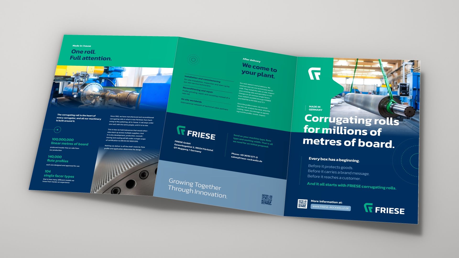
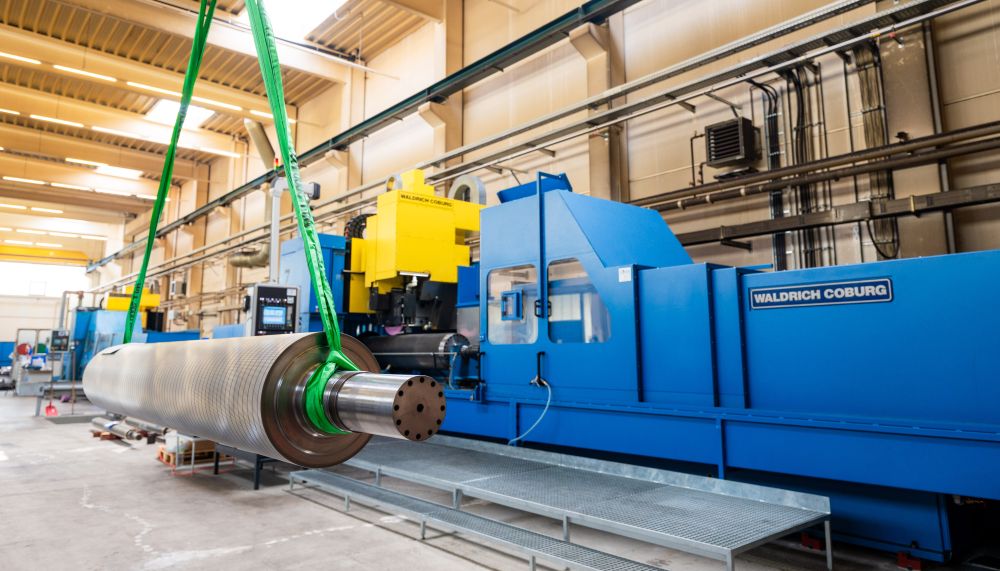
For decades, FRIESE has specialised in custom-made corrugating rolls. We’ve invested heavily in our production equipment to make rolls with greater precision and give our customers more flexibility in specifying what they need.
Today, we’re introducing a new corporate design that reflects that work. It starts with the product: the geometry of the roll and the corrugating process itself inspired the design of our new logo.
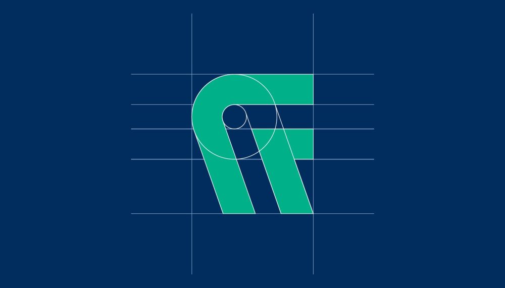
The signet combines the flute profile, the roll itself and the process of grinding the profile into the roll in a single shape. Together, these elements also form a clear F for FRIESE.
A triangle worked into the signet refers to the Rockwell hardness scale, whose test method uses a diamond tip. Our tungsten carbide coating ROCKWELLE® takes its name from the same scale.
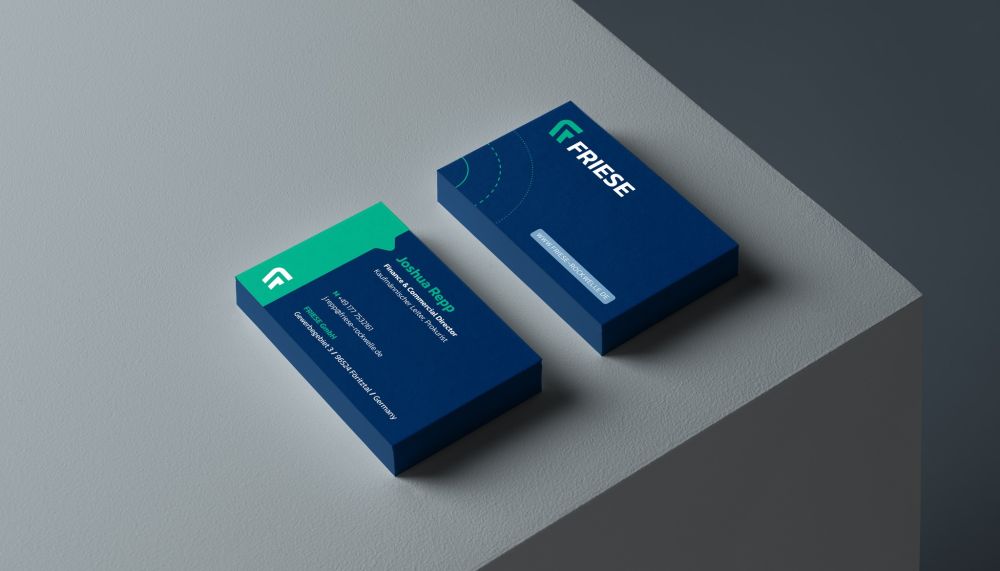
Alongside the logo, our corporate design includes a new colour palette, clear typography and design elements derived from the signet. Dark blue stands for reliability and trust, while steel blue reflects the character of the material. Our green picks up the colour scheme of our previous identity, deliberately brought up to date.
The new design runs through all our media, from the website and company brochure to business cards, letterhead and email signatures.
Our rolls are now available in nearly every market worldwide. As our reach has grown, so has the need to make technical information easier to find.
We’ve rebuilt our website so that experienced corrugator teams can get straight to the technical details, and anyone new to corrugating rolls can get oriented and find the right person to talk to.